vRealize Automation
Improving the process of onboarding existing machines from public clouds.

Improving the process of onboarding existing machines from public clouds.
vRealize Automation (vRA) is a complete Cloud Management Platform (CMP) that can be used to build and manage a multi-vendor cloud infrastructure. Using an automation solution, end users can self-provision virtual machines in private and public cloud environments, physical machines, applications, and IT services according to policies defined by administrators.
I worked as the sole designer on this project tasked with giving the end to end picture of how the new flow for onboarding plans would look like. My role involved creating designs for multiple Onboarding plan workflows, conducting user research, and collaborating with PMs and engineers on direction, alignment and technical details, respectively.
Most of the VMware customers when using vRA to manage infrastructure are not able to start clean. They already have existing machines and vRA should be able to help customers not only to create new machines but also easily onboard any machines that were not a part of vRA before. This helps customers to continue manage their existing infrastructure with a new vRA instance easily without having to create them from scratch.
For the project, we used the following process:
1. Requirements refinement
2. User Interviews
3. Pain Point Synthesis
4. Iteration and Prototypes
5. Validation and Refinement
Our goal was to ensure that unnecessary complexity be removed from the current flow while adding capabilities that would provide more flexibility in the way machines are onboarded in a simple, usable way inside vRealize Automation.
The project was done in 1 month approximately where I handed over the design within this timeframe and the devs then took another month to release the first set of features.
The Product Manager come's with a list of requirements and features that we intend to solve/release in the upcoming release with respect to onboarding plans.
These requirements are then further refined to understand what problems are we trying to solve for the user.
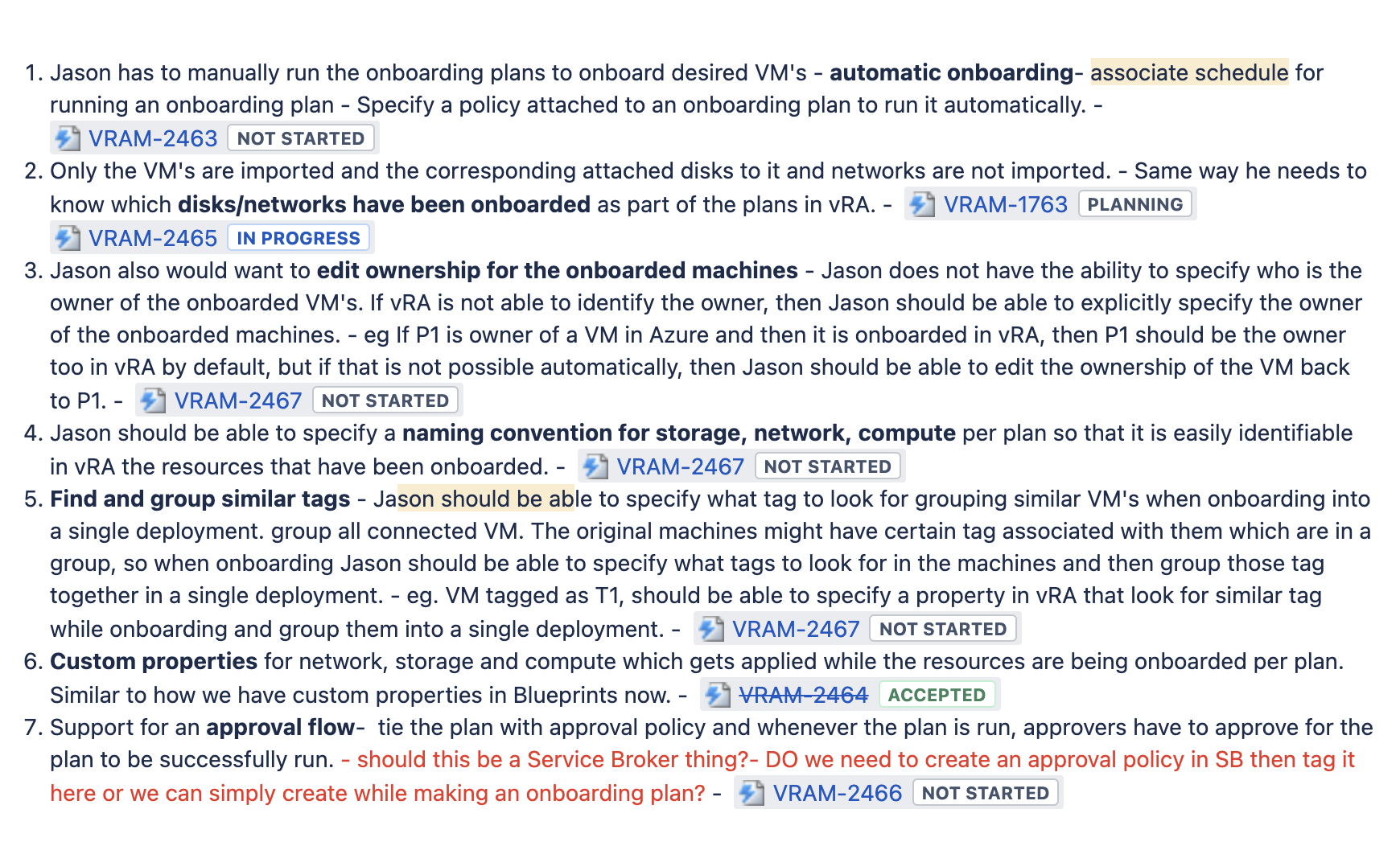
The current onboarding plans had the following requirements which we refined over discussions with the triad(PM, Engineering and UX).

These requirements were then further validated with users by having 1-1 interviews and understanding the pain points/ needs from the current system and whether these requirements would be fulfilling their needs for a better experience.
Since I was the sole designer in this project, I decided to run by a few user interviews before we start with the next phase of mocks and that we have a clear picture of what problems are we trying to solve and not just adding features for the need of it.
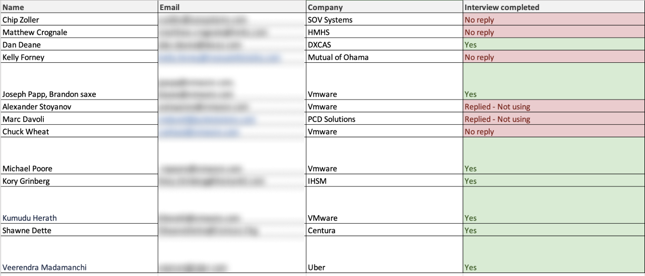
I sent out user interviews mail to a bunch of our users including internal users as well as TAM’s to get a perspective of the problems faced by them. I was able to have 7 interviews in span of 10 days before I could move on to the next phase and got a good grasp on the areas that needed to be tackled.

The interviews were a good starting point as it validated some of the hypothesis and the requirements that we were adding while also discovering some unmet needs which would be beneficial for the users to carry out their task smoothly.
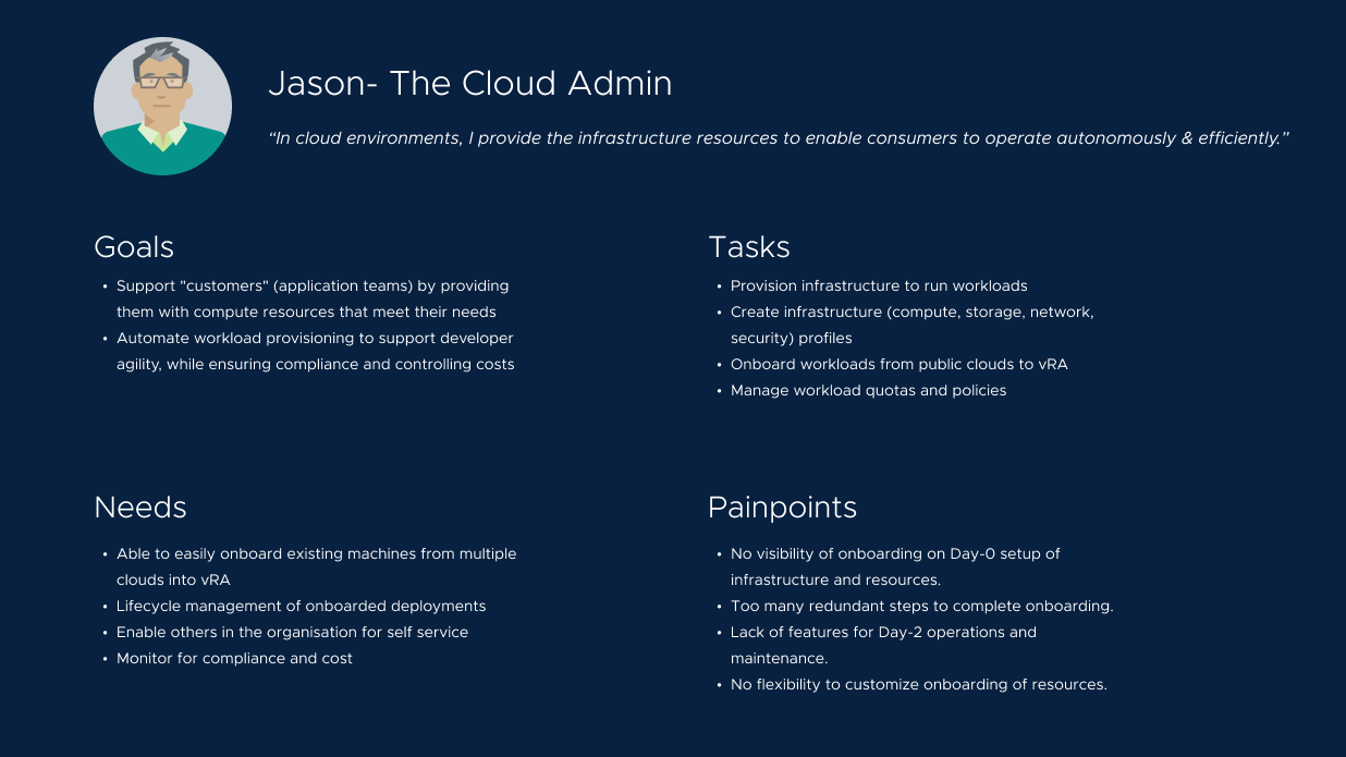
The interviews also helped defined the needs and pain-points of our persona - Jason who is the cloud administrator for the organisation.

We took a look at our users specific feedback, discussed business priorities with our PMs, and agreed the scope of this release will tackle following pain-points:

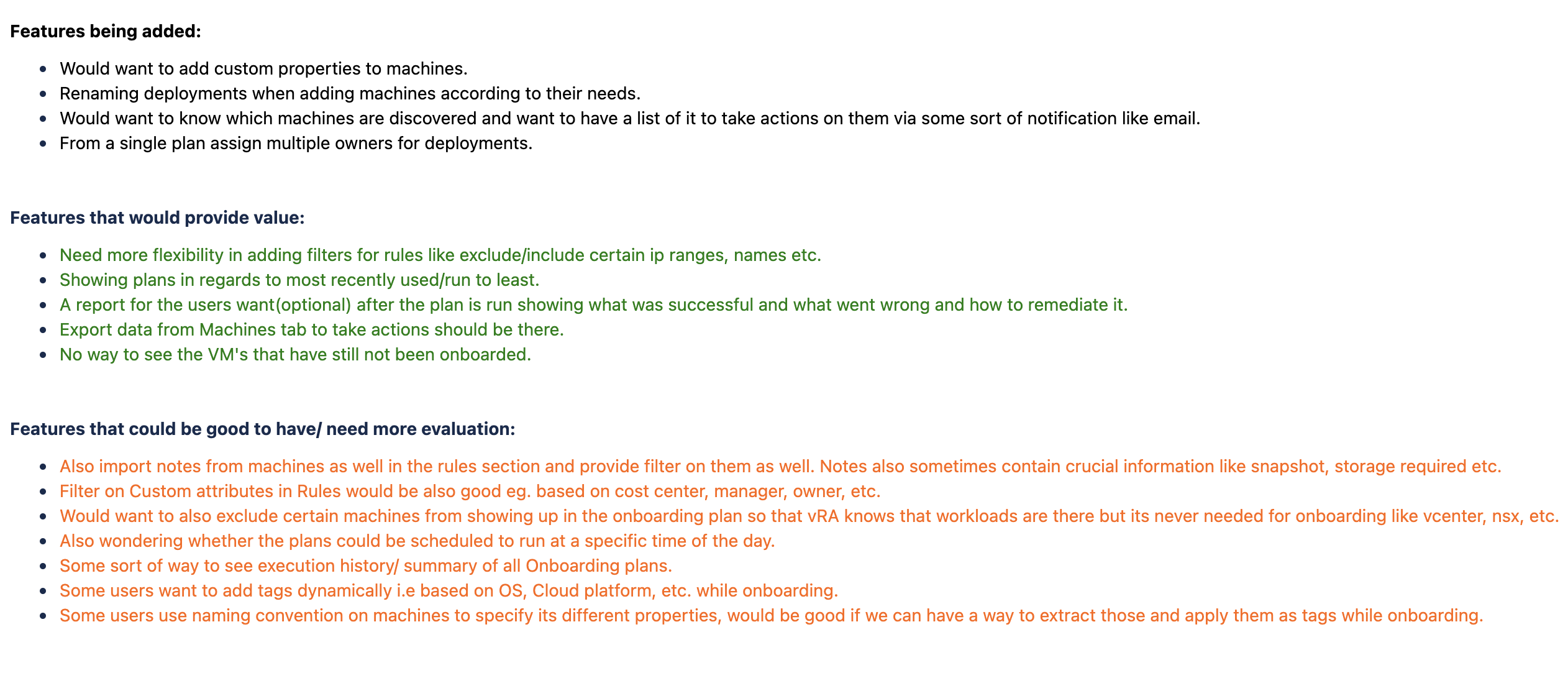
I also bucketed the feature requests into three categories depending on the impact to the users workflow starting with what we were implementing, what could be good to have and what needs further investigation. This gave a clear picture to all the stakeholders as to where we will be focussing from features point of view as of tiday and in the future.

Another great way to make consensus and get every stakeholder on the same page is by storyboarding the idea out and letting everyone know of the vision and the features that we are targeting and at the same time also answering the 'why' for what we are doing.
I made a storyboard of how the features would help Jason (our targeted persona) to better handle the onboarding plans.
Apart from this I also visualised the flow of how the onboarding plans would like look like from Day-0 and Day-2 prespective and where different personas will intersect so that we can further refine the screens based on how other personas were able to use the by-products of onboarding plans.
I made multiple iterations of workflows related to the feature and would often go back to the stakeholders for the feasibility check and to the users for validating the designs and getting feedback on how to improve it.
This phase of iteration happened over several weeks where we went back and forth testing with users and also showcasing the vision in Design Partner Program(DPP) which happens monthly to gather various stakeholders and users under one umbrella and get feedback on the upcoming features for vRA. The iterations I made were based on both user and stakeholder input.
Here are the major areas from the pain points synthesis which I redesigned over several weeks to simplify and provide value to our users using the onboarding plans.
We first ideated a lot over how we can simplify the process of onboarding as the current was too redundant and complex to understand. We started with adding elements that would help in easy creation of the plans but as we tested it out with our users we found that "Rules" section was not used by most of the users and they went straight to the machines tab but they also wanted to onboard extra resources like Networks and Storage which would be beneficial to them.
One of the major pain points that I discovered was that greenfield customers were unaware of onboarding plans and hence we were missing out a lot on making them see the value of our product to manage their workloads. We needed to make sure that this feature was visible from the start and customers would need a frictionless experience to realize the potential that the product holds in simplifying their workload management.
Another key aspect combined with the simplification of onboarding plans was to empower the user to manage their onboarded deployments with specific actions and help them in making informed decisions regarding rightsizing and optimization for cost and efficiency.
This project was a great eye opener not only for me as a designer but the whole team, where we realised that the user wanted to see quick wins early on to be able to place trust and use the product for long term. This boomeranged into a whole new initiative of Time To Value(TTV), where we looked at the whole of our product and asked the same question as to what can we do in the first ten minutes to make the user relaise the power of the tool and place its trust on using it.
Personally for me, it was a great learnig experience to bring the team to alignment over the problems that we needed to solve rather than going into the solutions head first. It also was re-inforcement of the belief that if we design keeping user in the centre of the process we would not only solve their problems but also get unique insights which we can apply to other areas of the product as well.

Thank you for reading