Complete re-design of online collaboration tool
Object Attribute Manager
An exciting project done at SAP Labs, Bangalore as a User Experience Designer under the Products & Innovation Tools team to completely re-design the experience of an online collaboration tool used internally by the teams within SAP for multiple purposes.
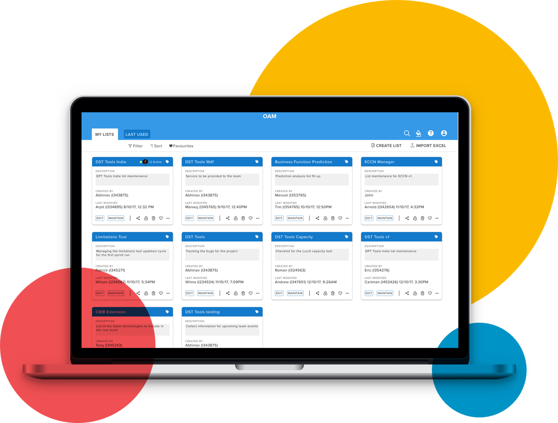
The Object Attribute Manager (OAM) is a generic tool for creating flexible object structures in an Excel-like manner for storing and maintaining excel-like object lists in tables.
It was introduced to address the following typical problems, when working with XLS tables, or lists:
OAM is not just an excel sheet but is part excel and part database with flexible structure (customizable
with components like drop down, checkboxes, linking to other tables etc.) and real time collaboration.
It can not only be used just for project management but is also useful in any scenario where anything
needs to be maintained and tracked where lots of stakeholders are involved.
In short, it’s a great organizational tool which can be used by anyone within the organization to manage
anything easily.
Heuristics Evaluation
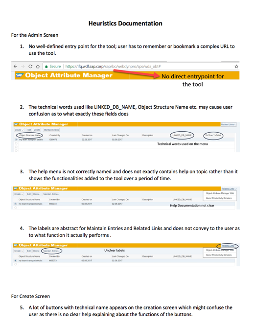
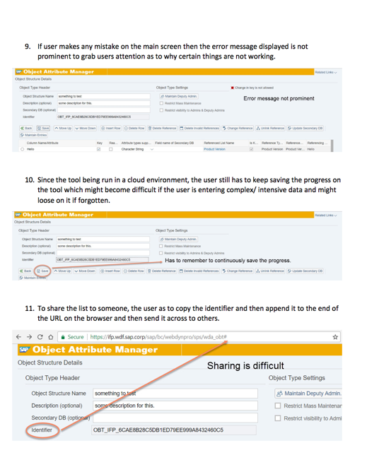
A detailed heuristics evaluation of the current tool was done with respect to the Nielsen Norman’s 10
usability heuristics.
Each heuristic was numbered relating to the standard it was violating and properly documented in a
report format with accompanying screenshots for each.
Comparative Analysis
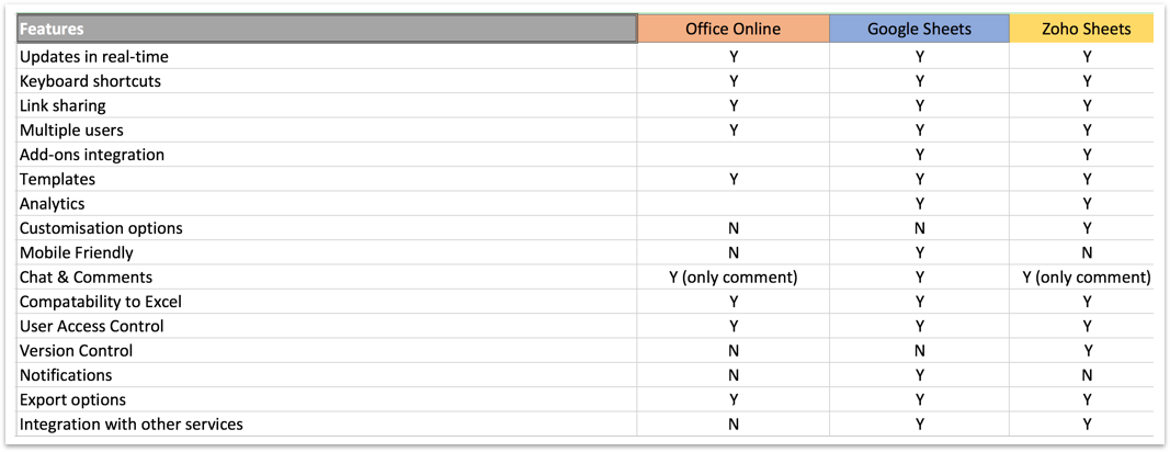
The similar functionalities that OAM provided was being offered by the three major players in the
market.
Their core product was studied and each of the features that the tools provided was laid out in a
comparative analysis to find out where our current tool stood.
Interviews
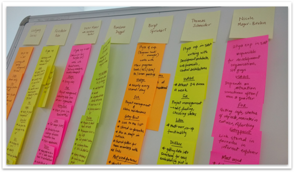
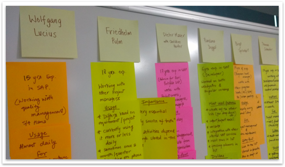
A number of stakeholders were identified for the tool and then the interview process was carried with
the users to understand and gain insights about how they use the tool, what they feel about it, their
frustrations and pain points.
The results were mapped and insights taken out from the interview highlighted some common patterns.
Online Survey
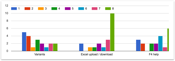
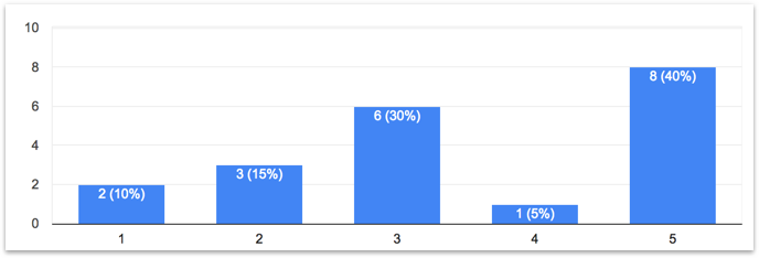
The interviews gave us the why we were looking for, but the survey results helped in quantifying the information and pin pointing exactly what needed to be addressed to improve the experience of using the tool.
Persona
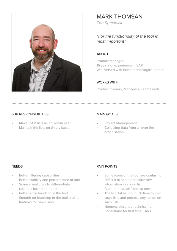
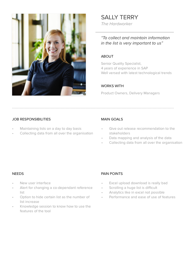
After mapping the insights and from the interviews and the survey results, 2 personas were created to encompass the different user needs and aspirations.
User Journey
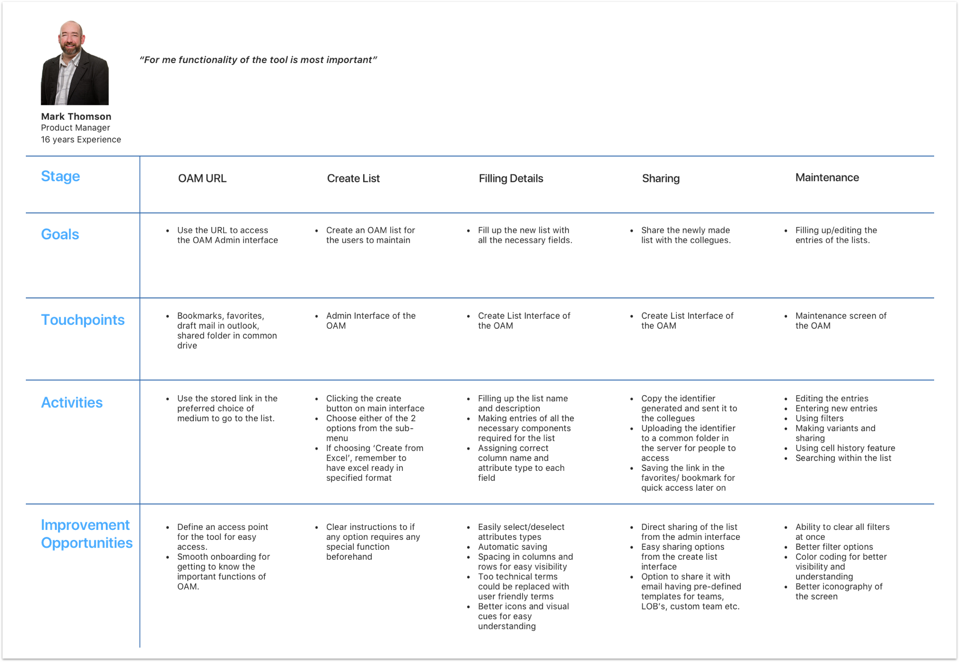
The user journey was also mapped of the to show exactly at which step what problems are faced by the users and what goes through their minds when going through that particular phase.
Wireframes
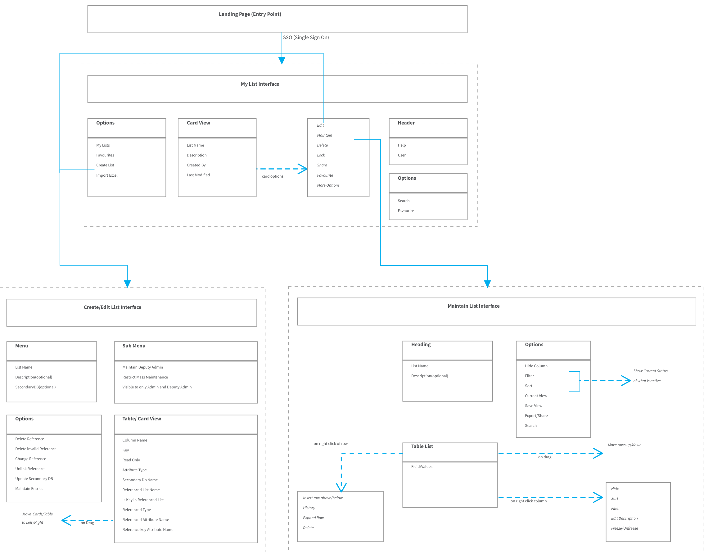
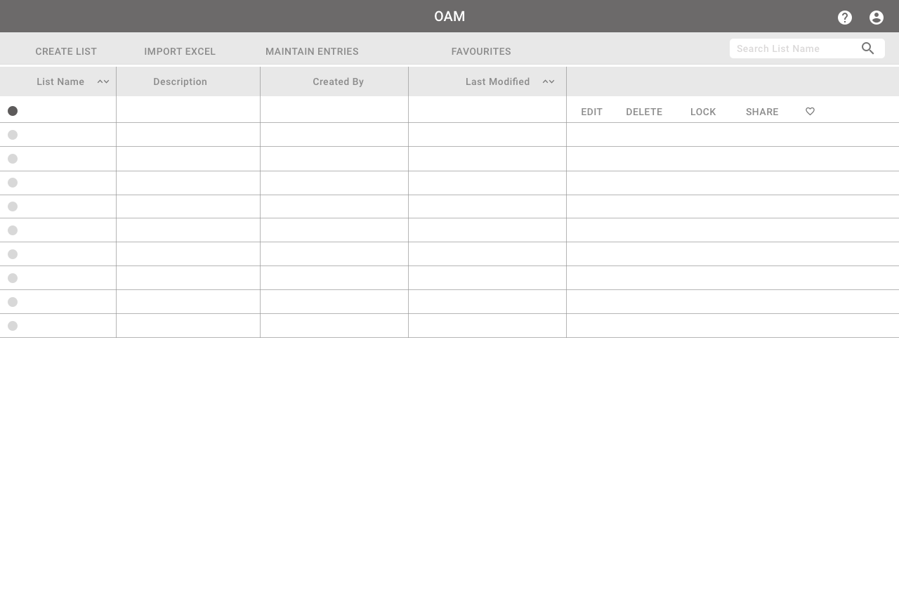
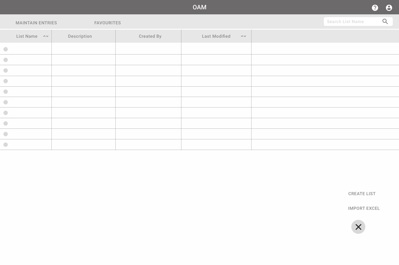
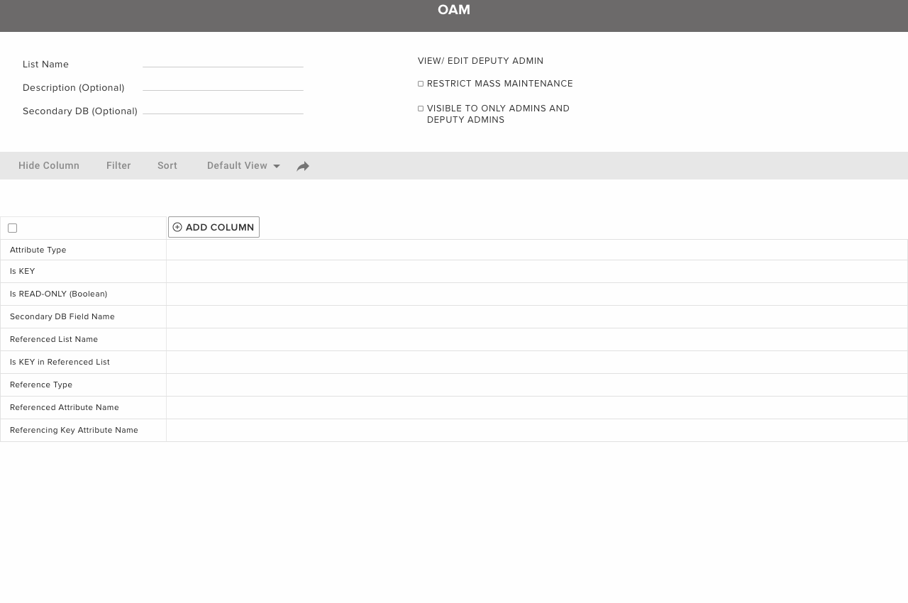
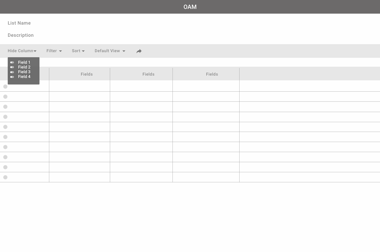
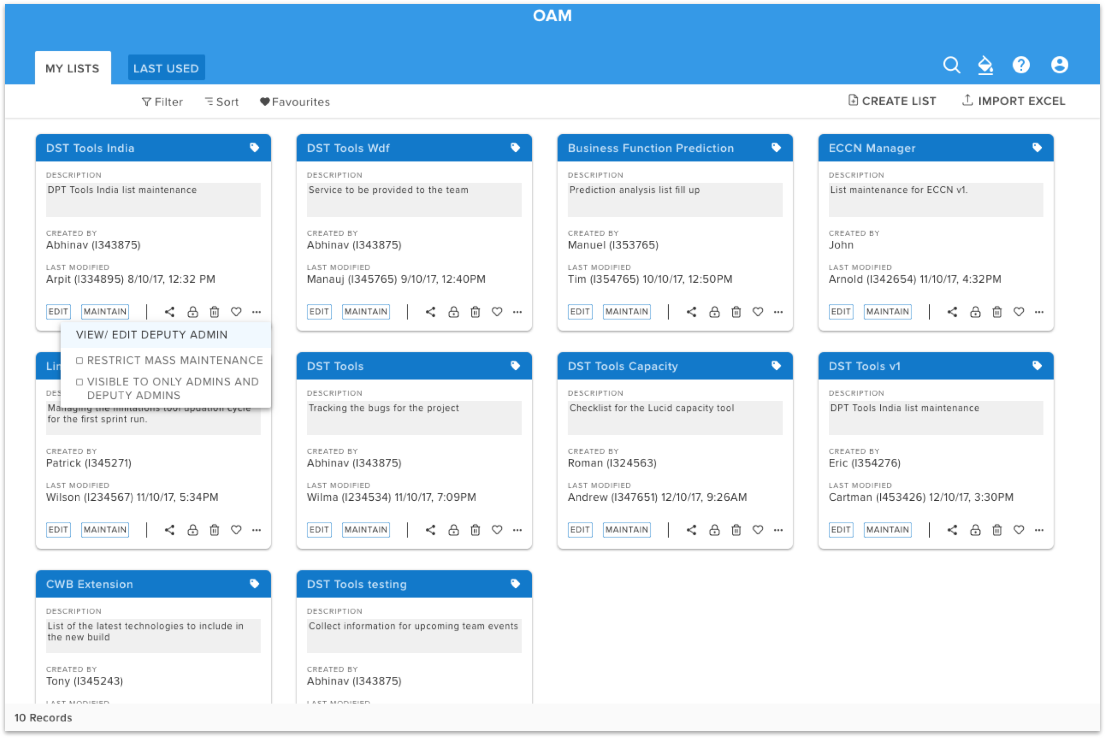
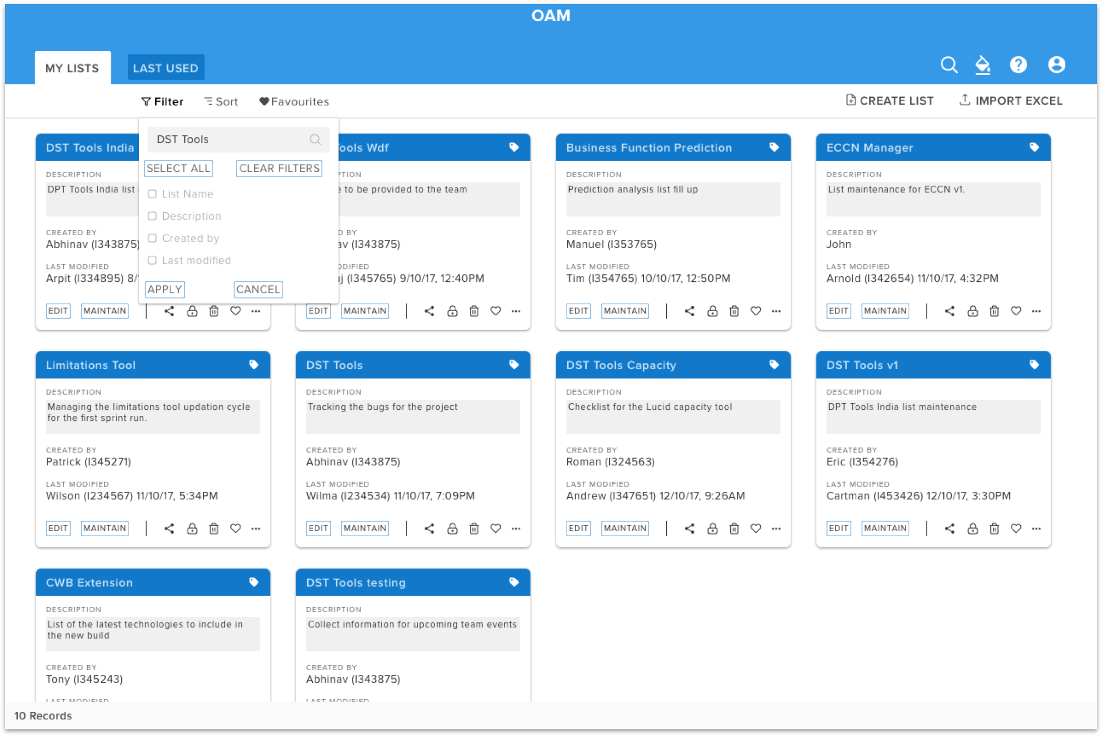
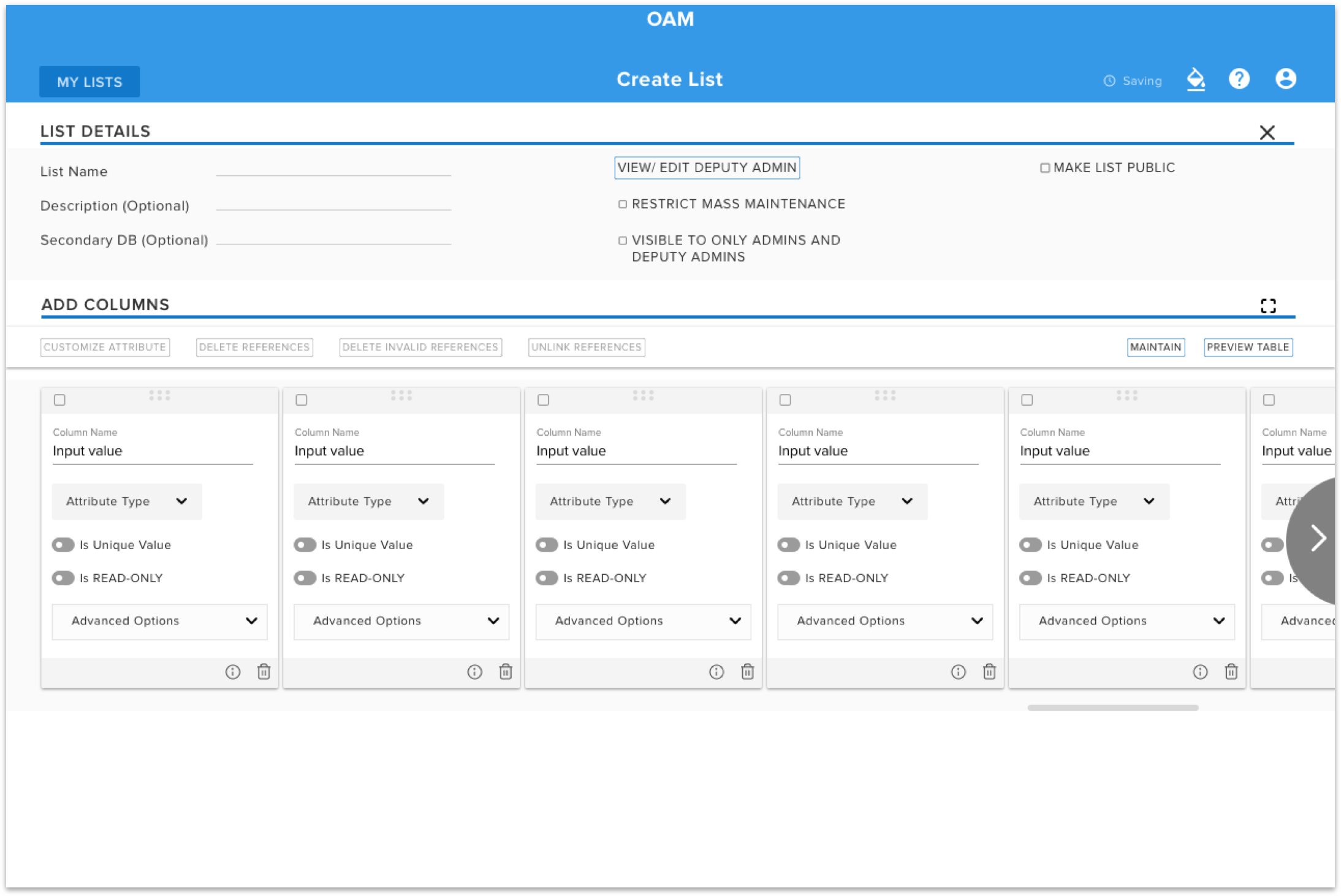
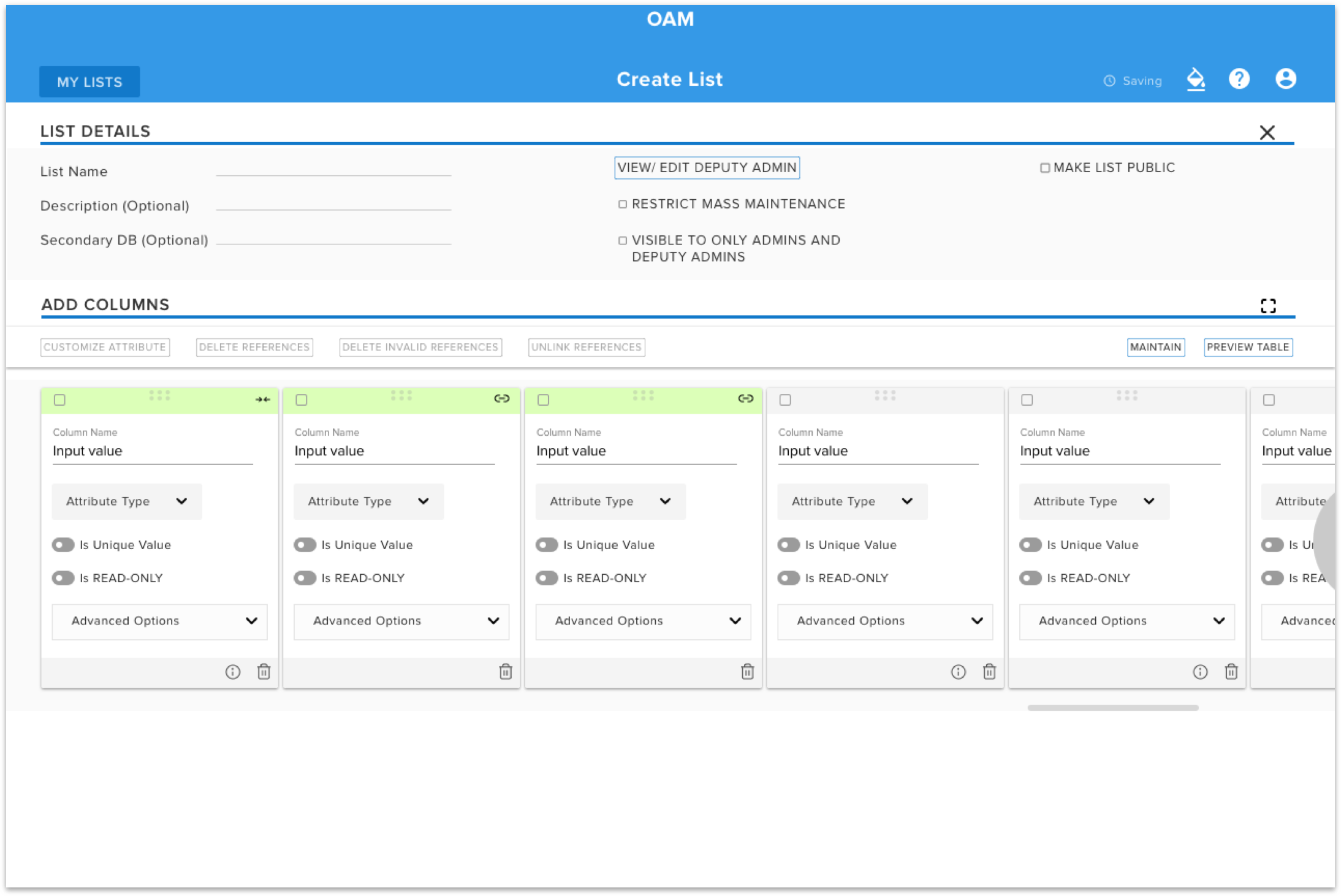
Wireframing were done to reflect the insights on to the screen for different aspects of the tool. Different sections of the tool were wireframed extensively to get a rough idea of how the interface would look like.
Mockups
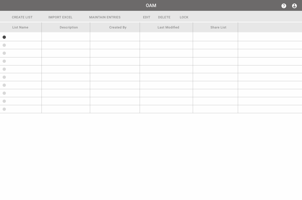
The initial wireframes were refined to create the final mockups.
Many iterations of the mockup took place - first while making the interface and then after the usability
testing with the users.
P.S - I'll be happy to show a full working prototype offline.
Thank You for watching